- Augusta University
- Accessibility
- Web Accessibility
Web Accessibility
We are committed to making our web presence accessible and welcoming environment for all.
Augusta University follows the Board of Regents (BoR) Accessibility Guidelines and strives to ensure that electronic and information technology resources are accessible to all students, faculty, staff, and the general public. Creating and maintaining accessible technology is an ongoing responsibility and priority at AU. We are working to meet the Web Content Accessibility Guidelines (WCAG) 2.2 at the AA level for our digital content.
View Accessibility on the Web presentationAccessibility Training Courses
Headings
Use headings to help organize page content. When used properly, headings can not only help visitors visually find content on a page, but can be used to navigate by those relying on assistive technologies such as screen readers.
Page headings should be nested by rank with h1 being the highest and h6 being the lowest.
H1 - Page Heading
H1 is used only once on a page as the main page heading. This is automatically added as part of the page template and can be edited in the Properties.
Sections and Subsections
Headings of equal or higher rank denote new sections. Headings with lower rank indicate subsections within the current section.
- [h1] Page Heading
- [h2] New Section
- [h3] Subsection
- [h3] Subsection
- [h2] New Section
- [h2] New Sections
- [h3] Subsection
- [h2] New Section
Images
Images should not be used as a primary means to communicate information as they cannot be properly viewed by persons with any manner of vision impairment or persons using assistive technologies. Additionally information contained in images cannot be displayed in search results.
Alternate Descriptions
Images should contain alternate descriptions that can be read by screen readers or displayed when images cannot load due to connection issues or user preference. The alternative description should contain any important information in the image and/or describe the image or the feeling the image is trying to convey.
When adding an image using Modern Campus CMS enter a description in the alternative description field.
Images of Text
It is crucial to understand that embedding text within images fundamentally undermines accessibility. Screen readers, search engines, and individuals with visual impairments cannot interpret this text. It is never appropriate to use images to convey textual information, regardless of whether it's for banners, flyers, magazine covers, or any other purpose.
While alternative text descriptions are essential for all images, they are not a substitute for directly providing text when the primary function of the content is to communicate a message. If the core purpose of an image is to present text-based content, such as in a flyer or poster, it is not suitable for use on our website.
Images as Links
If images are used to link to additional information - for instance, a picture of cover art linking to a downloadable pdf - the image should indicate it is a link and the alternate description should also describe what it links to.
Graphs, Charts, and Infographics
When images are used to convey data and/or information, a text-equivalent should also be made available.
Multimedia
Content presented in video or audio format needs to also be available to persons unable to access the content in its original medium.
Video
Videos should contain closed captioning. If closed captioning is unavailable, a transcript should be provided.
Visual information in videos, such as graphs or on-screen text, should be described in the video or otherwise made available in non-visual formats or formats accessible by assistive technologies.
If a video contains flashing lights or rapidly moving images, an epilepsy warning should precede the video.
Audio
Transcripts should be provided for audio-only content.
Tables
The exception to the above would be the use of snippets since that content is not saved or published as a table.
| First Name | Last Name | Available? |
| John | Doe | No |
| Jane | Doe | Yes |
For better accessibility and usability tables should define columns with header titles.
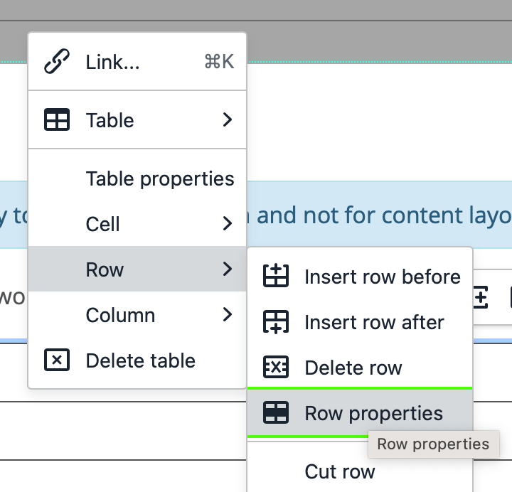
Table headers can be denoted by highlighting the table row in the WYSIWYG, right-clicking on the row, selecting Row in the menu, selecting Row properties, and then selecting Header in the Row type drop-down.

Accordions
Accordions, while seemingly space-saving, present several usability challenges. They fragment information, forcing users to repeatedly interact to access content, increasing cognitive load. This hinders the discoverability of hidden information and complicates printing. Moreover, ensuring accessibility for keyboard and screen reader users is extremely difficult. These factors lead to a less user-friendly experience and diminish the effectiveness of the website's content. For these reasons, accordions should not be used on the Augusta.edu website.
Documents
All documents linked within university web pages must also be remediated for accessibility. This includes, but is not limited to, providing alternative text for images, writing descriptive labels for links, arranging a clear document structure, using accessible table formatting, and verifying sufficient color contrast. Prioritizing document accessibility ensures equal access to information for all visitors to Augusta.edu.
Accessible Documents TutorialAccessibility for Documents Course
Understanding Accessibility Check Results
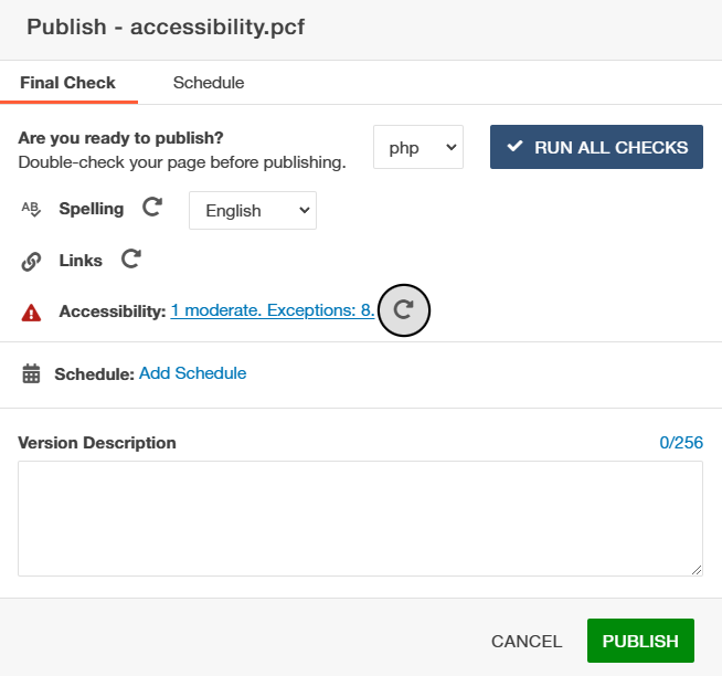
The Final Check feature in Modern Campus CMS reviews your page for spelling, link and accessibility errors prior to publishing. If Accessibility Check errors were found, a red alert triangle will appear in front of the accessibility check section with a link to the view the results.

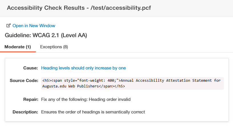
The Accessibility Check Results displays a list view of all problems detected on the page. Each item displayed in the Accessibility Check Results includes a reference to the exact line in which the errors were found and an explanation of the problem. Accessibility Check Results are segmented out by Severity and Exceptions. Exceptions have no bearing on your accessibility check and can be ignored. Each accessibility problem found under Severity (Low, Moderate, or Critical) is segmented out by cause and includes details to help you identify and repair the problem.
In the example below, the heading levels are out of order with an H5 appearing after an H2. To correct this error, you would need to change the h5 to an h3 so that it follows a logical heading order.

Once you review the Accessibility Check Results, return to the Page Edit View. Using the WYSIWYG editor, make the necessary changes to fix the accessibility problems listed in the Final Check results.
Once you have fixed the error(s), the accessibility check will be re-run on publish to confirm that the page is fixed.
When all Accessibility Errors have been fixed, you will see a Green Checkmark in front of Accessibility indicating that it has passed the Accessibility Check and your page can be published.